


The lasting design story of Rand Bridge
Some logos identify a company. Others become symbols of an entire era. The IBM logo history is one of the best examples of how graphic design can become part of a company’s identity, culture and business strategy. What appears today as three simple letters divided into horizontal stripes is actually the result of decades of evolution, strategic thinking and one of the most influential designer-client relationships in corporate design history.
The story of the IBM logo is also the story of how a company learned to use design not merely as decoration, but as a way to communicate what it wanted to become.
IBM Logo History Begins Before the Famous Stripes
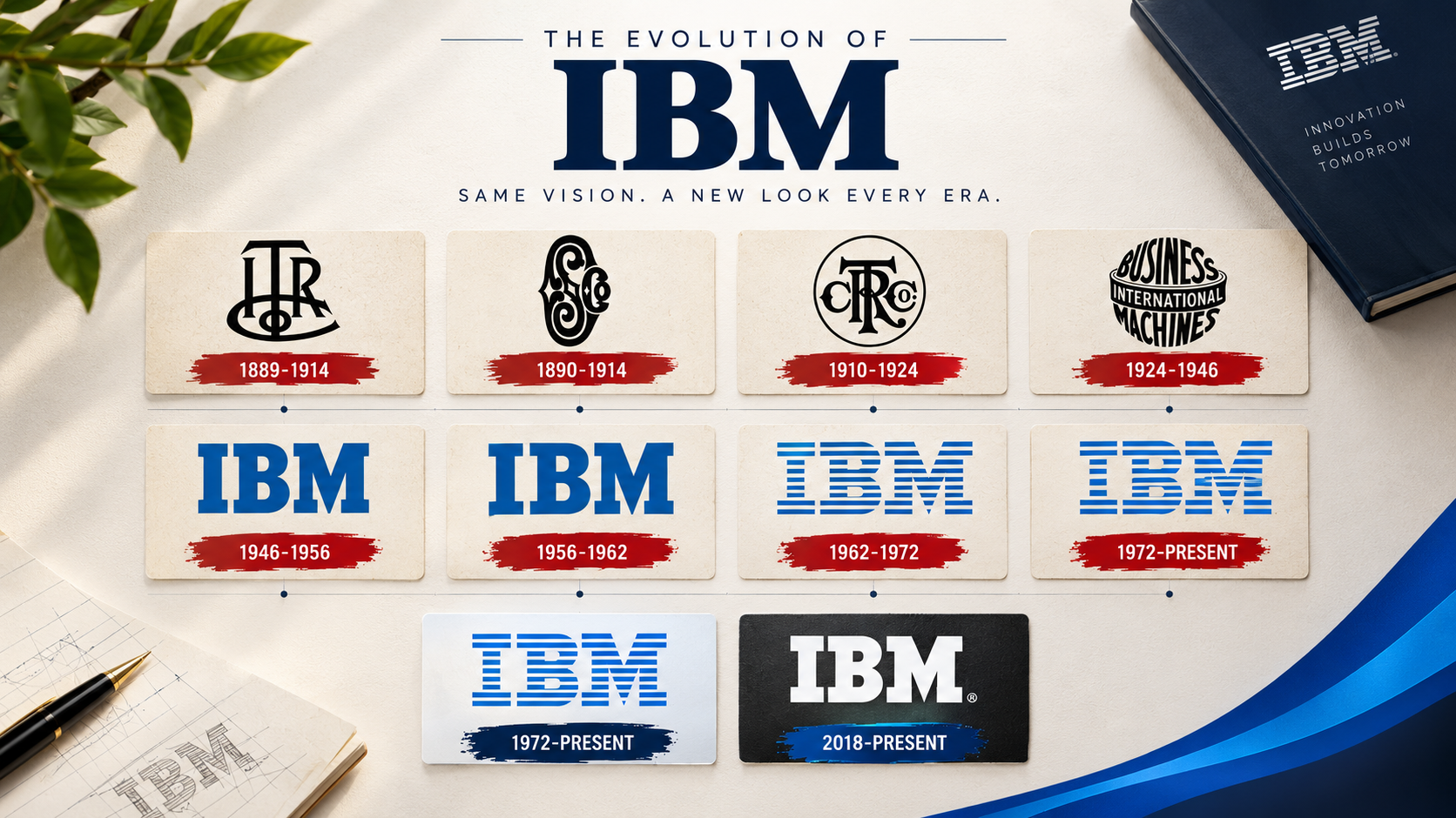
The IBM logo did not begin with the famous eight horizontal bars. The company’s origins go back to the Computing-Tabulating-Recording Company, or C-T-R. In 1924, the company adopted the name International Business Machines, creating the corporate identity that would eventually become known simply as IBM. As the company developed, its visual identity evolved with it.
The early IBM identity was more traditional and decorative than the modern wordmark people recognize today. But IBM was moving into a new technological era, and its visual language needed to change with the business. This is where the relationship between business strategy and design became particularly important.
IBM Logo Design Becomes Part of a Larger Strategy
During the 1950s, IBM was transforming itself into a major technology company. Thomas J. Watson Jr., who became IBM’s president in 1952, believed strongly in the power of design. Rather than treating design as something added after a product or business decision had been made, he wanted design to become part of IBM’s overall corporate culture.
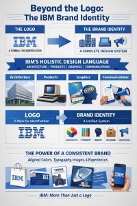
IBM hired architect and designer Eliot Noyes in 1956 to develop a comprehensive design program. The goal was much broader than creating a new logo. Architecture, products, graphics, communications and corporate identity all became parts of a larger visual system. IBM’s own historical material describes this period as the beginning of a company-wide design philosophy.
This decision created the environment in which Paul Rand’s work for IBM would eventually become possible.
Paul Rand and the First Major IBM Logo Redesign
Paul Rand was already one of America’s most influential graphic designers when he began working with IBM. His design philosophy emphasized simplicity, clarity and strong visual ideas. In 1956, Rand redesigned the IBM wordmark.
The new design was more modern and distinctive while preserving the three-letter name that customers already recognized. This was an important principle in the IBM logo history: Rand did not throw away the company’s accumulated recognition and start from zero. Instead, he refined it. The letters themselves became the foundation of the new corporate identity. That approach would become even more important sixteen years later.
IBM Logo History Takes a Turning Point in 1972
The most famous chapter of the IBM logo history arrived in 1972. By that time, IBM had become one of the world’s leading technology companies. The company needed an identity that could represent a sophisticated, modern and increasingly international organization. Paul Rand returned to the IBM wordmark. His solution was deceptively simple.
He divided the letters with horizontal lines, creating the now-famous IBM 8-bar logo. The result retained the company’s name while giving the typography a unique visual structure.
IBM introduced the eight-bar version in 1972, and the fundamental design has remained unchanged since then. That longevity is remarkable. Most corporate identities experience multiple major redesigns over several decades. The IBM logo instead became a stable visual asset while the company itself continued to evolve.
Why the IBM 8-Bar Logo Works
At first glance, the IBM logo design looks extremely simple. Three letters. Eight horizontal bars. Nothing unnecessary. But effective simplicity is rarely accidental.
The IBM Logo Keeps the Brand Name Visible
One of the smartest decisions in the IBM logo design was retaining the actual company name. The audience does not have to learn an abstract symbol before understanding what the brand represents. The letters remain readable. The visual treatment creates the distinctive identity.
The IBM Logo Creates a Unique Visual Signature
There are countless three-letter company names. But the striped IBM lettering is immediately recognizable. The horizontal bars transform ordinary typography into a visual signature. This is one reason the IBM logo history is so useful for designers studying corporate identity: the design demonstrates how typography itself can become a brand asset.
The IBM Logo Works as a System
A corporate identity needs to function in many environments. A logo may appear on:
- office buildings
- products
- printed documents
- advertisements
- packaging
- exhibitions
- signage
- digital interfaces
The geometric structure of the IBM 8-bar logo allows it to maintain its identity across many applications.
IBM Branding Was Bigger Than the Logo
One of the most important lessons from the IBM logo history is that the logo was never intended to work alone. IBM developed a much broader design language around its corporate identity.
The company’s design program influenced architecture, products, graphics, communications and other customer touchpoints. That distinction is essential. A logo is an identifier. A brand identity is a system. The difference is enormous.
A business can have a beautiful logo and still have a weak brand if its typography, colors, photography, packaging, advertising and customer experience feel disconnected. IBM’s approach demonstrated the opposite. The logo became one component of a much larger visual language.
The IBM Logo Became a Corporate Asset
Over decades of consistent use, the IBM logo became more than a piece of graphic design. It became a shortcut for ideas associated with technology, computing, engineering and innovation.
IBM describes the 8-bar mark as one of its most valuable corporate assets and one of the world’s most recognizable corporate identities. But that value was not created overnight. It was built through repetition. People saw the same core visual identity again and again. That created recognition. Recognition created familiarity. And familiarity contributed to brand equity. This is an important lesson for any company investing in logo design and corporate identity.
A logo becomes valuable when the business consistently uses it and gives it meaning.
The IBM Logo Did Not Need to Chase Every Design Trend
Another fascinating part of the IBM logo history is its resistance to unnecessary redesign. The basic 8-bar design has remained unchanged since 1972. That does not mean IBM stopped evolving.
The company has changed its applications, colors, imagery, typography and digital experiences over the years. But the fundamental logo remained recognizable. This is the difference between evolution and reinvention.
A brand can modernize its communication without destroying the visual asset that customers already recognize. For established companies, this can be an extremely valuable strategy.
Paul Rand’s Eye-Bee-M Experiment
Paul Rand also demonstrated that a corporate identity could be playful without becoming inconsistent. In 1981, he created the famous Eye-Bee-M rebus, using an eye and a bee to visually represent the sounds in the IBM name.
The concept was created for an IBM THINK-related poster and later became an important part of IBM’s design history. IBM notes that the rebus eventually entered the permanent collection of the Museum of Modern Art in New York. But there is an important distinction.
The Eye-Bee-M concept did not replace the official IBM logo. It was an expressive variation used in an appropriate context. This shows how a strong brand can allow creative experimentation without sacrificing its core identity.
What the IBM Logo History Teaches Designers
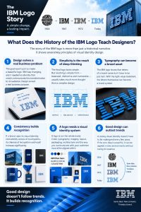
The IBM logo history is valuable because it contains lessons that extend far beyond IBM.
Design Should Solve a Business Problem
The objective was not simply to create something attractive. IBM needed an identity that could represent a changing technology company. The design supported that strategic goal.
Simple Design Requires Complex Thinking
The final IBM logo looks effortless. But reducing a complex corporate identity to a simple, memorable visual form requires considerable strategic and design thinking.
Typography Can Become a Brand Asset
The IBM logo demonstrates that letters do not have to remain ordinary typography. With the right treatment, a wordmark can become a powerful visual symbol.
Consistency Builds Recognition
A strong identity becomes more valuable when people encounter it consistently across different touchpoints.
A Logo Needs a Broader Identity System
Logo, typography, color, layout, photography, packaging, architecture and communication should work together.
Great Design Can Survive Trends
The IBM logo has survived decades of technological and cultural change because its core visual idea is strong enough to remain relevant.
What the IBM Logo History Means for Packaging and Print
The lessons from the IBM logo design are especially relevant to packaging and print. A brand does not live only on a website. It appears on:
- product labels
- boxes
- bottles
- brochures
- catalogs
- business cards
- signs
- displays
- shipping materials
- retail packaging
Every printed surface is an opportunity to strengthen brand recognition. For packaging designers, there is another important consideration. An identity must survive the physical production process. A design may need to work with:
- one-color printing
- CMYK printing
- spot colors
- embossing
- debossing
- hot foil
- cold foil
- varnish
- textured substrates
- small-format labels
- large-format packaging
The strongest identity is not simply the one that looks impressive on a screen. It is the one that remains recognizable when it becomes a physical product.
This is where the relationship between brand identity, graphic design and printing becomes critical. A beautiful concept must eventually survive real materials, production constraints and repeated commercial use.
Why the IBM Logo Still Matters Today
The IBM logo history is ultimately not a story about eight horizontal bars. It is a story about the relationship between business strategy and design. IBM was changing. Technology was changing. The market was changing. The company understood that its visual identity needed to communicate that transformation. Paul Rand translated that challenge into a remarkably simple visual idea.
The result became one of the world’s most recognizable corporate identities. The most impressive part is not simply that the logo survived for decades. It is why it survived. It remained distinctive. It remained recognizable. And it remained flexible enough to exist within changing design systems and technologies. That is the difference between a temporary visual trend and a lasting identity.
The Real Lesson Behind the IBM Logo
The biggest lesson from the IBM logo history is not that simple logos are better. It is that successful design must have a reason to exist. IBM did not become recognizable because someone drew eight lines across three letters.
The identity became powerful because the design was connected to a much larger corporate strategy—and because the company consistently used that identity for decades. For designers, printers and packaging professionals, this is perhaps the most valuable takeaway.
Great design does not simply make a company look different. It creates a visual idea that people can recognize, remember and associate with the business.
That is what turned the IBM logo from a wordmark into a lasting corporate asset.
Frequently Asked Questions About IBM Logo History
Who designed the IBM logo?
Graphic designer Paul Rand designed the iconic IBM 8-bar logo, which was introduced in 1972. Rand had previously redesigned the IBM wordmark in 1956.
When was the IBM 8-bar logo created?
The famous eight-bar version of the IBM logo was introduced in 1972. IBM states that the basic design has remained unchanged since then.
Why is the IBM logo so recognizable?
The IBM logo combines a readable company name with a distinctive geometric treatment. Decades of consistent use have also strengthened recognition and brand equity.
What can packaging designers learn from IBM?
The IBM identity demonstrates that a brand needs to work across multiple physical and digital applications. A strong identity should remain recognizable across different sizes, materials, printing processes and communication channels.
Did Paul Rand create other IBM designs?
Yes. Rand worked extensively with IBM and created additional visual work, including the Eye-Bee-M rebus in 1981.
Further Reading
For readers interested in the history of IBM’s visual identity, the company’s official design and history resources provide additional information about the IBM logo, its design program and the 8-bar identity.
Suggested external sources:
- IBM — The History of the IBM Logo
- IBM Design Language — 8-Bar
- IBM Design Language — Rebus
- IBM — Art and Architecture
To build a strong internal linking structure around this article, connect it to relevant pages on the website:
- About Amin Lesani — link to the personal profile page
- Brand Identity & Packaging Services — link to the relevant services page
- Label & Packaging Portfolio — link to the main portfolio archive
- Brand Stories — link to the Brand Stories category
- Design & Printing Articles — link to the relevant blog category